

The Problem
The Special Olympics of Texas website is inaccessible, inconsistent, and redundant. As a result, users are experiencing feelings of alienation, confusion, and frustration when navigating the website and when attempting to register as an athlete or volunteer.

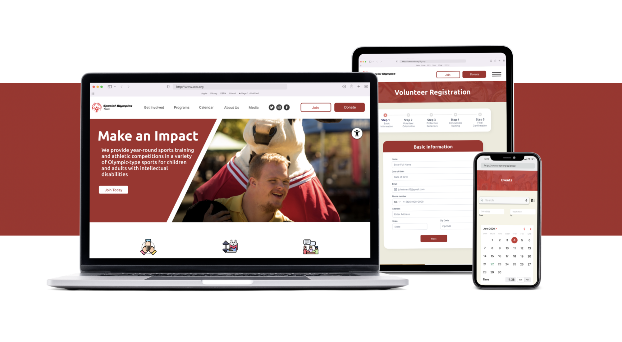
Special Olympics of Texas Homepage prior to redesign
The Solution
Organizing and simplifying the website design decreases the likelihood of users feeling confused or frustrated. Ensuring the website is fully accessible allows for more people to interact with the organization’s website.
The Impact
Users have less negative feelings when interacting with the organization's website and no potential athletes or volunteers will be alienated from the lack of accessibility, increasing the probability of more registrations.
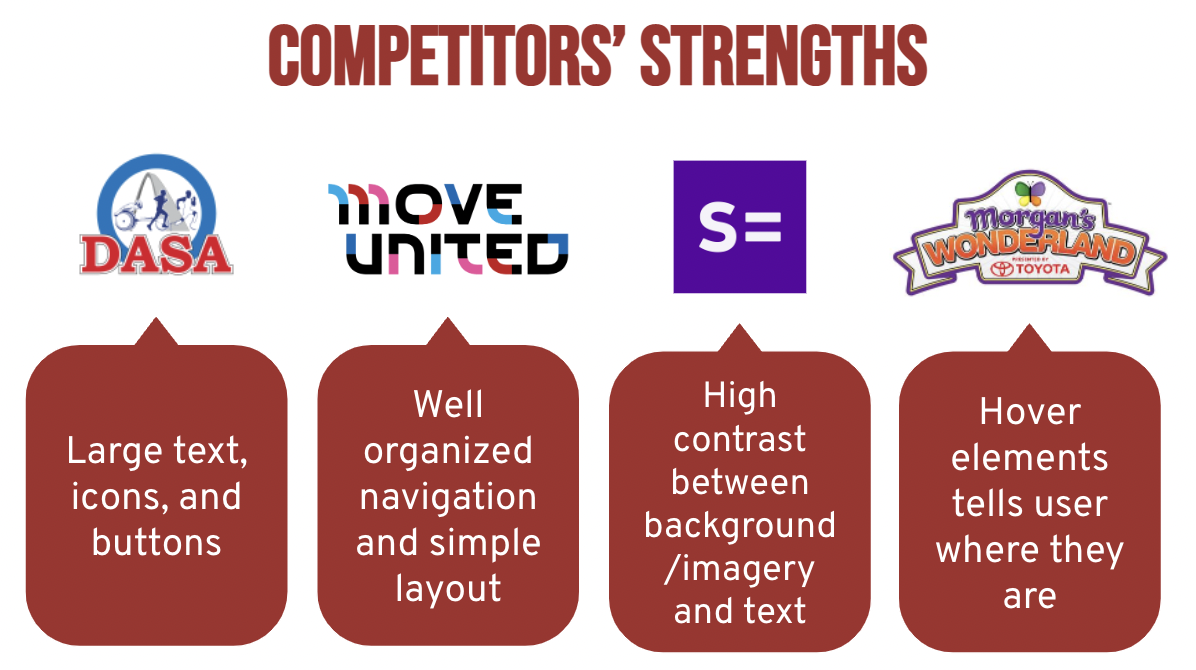
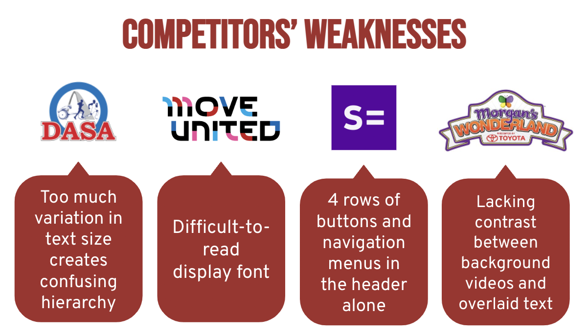
Research
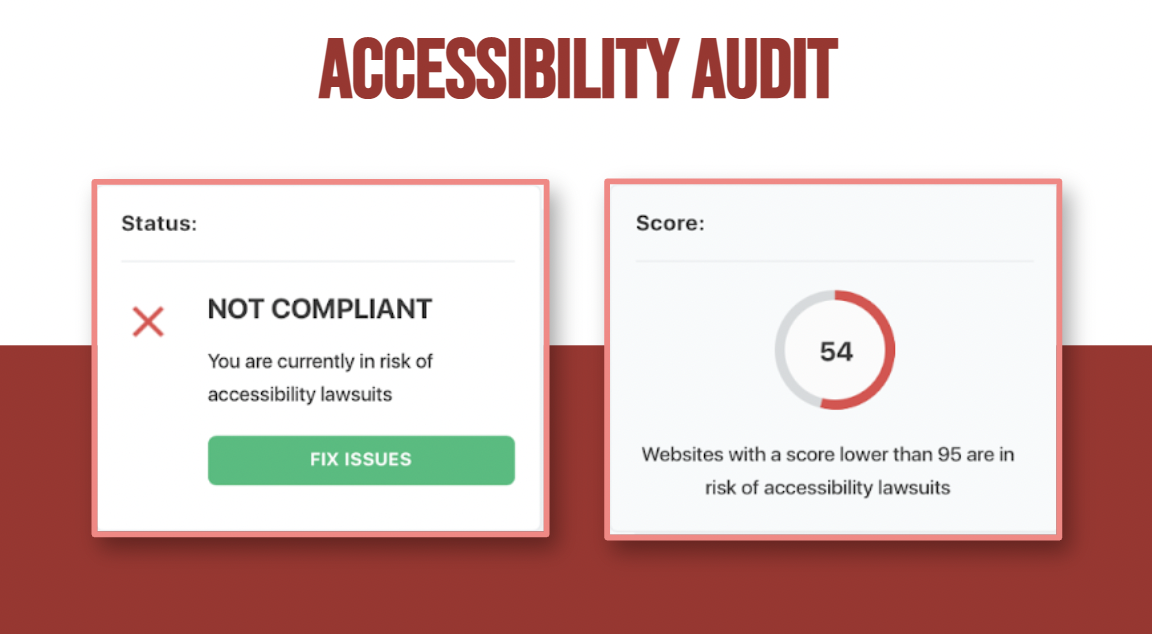
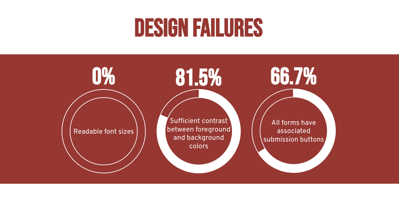
I began with an accessibility audit. Turns out that the Special Olympics of TX website, known for helping intellectually disabled people, has many accessibility compliance issues. The website received a score of 54 out of 100, with anything under a score of 95 being at risk of a lawsuit.
The audit revealed some key takeaways of design failures on homepage. Out of 8 instances of font sizes, 8 failed to be large enough to qualify as readable. Out of 162 instances of variation between foreground and background colors, 30 failed to provide enough contrast. Finally, out of 3 separate forms on the homepage, only 2 had submission buttons.
I discovered these key user insights: greater emphasis on the event calendar, and obvious mission statement, and more digestible pages.

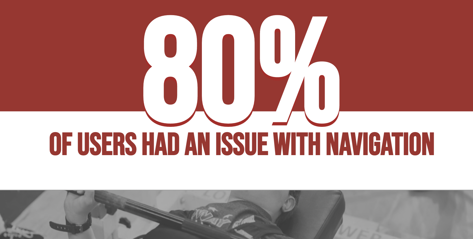
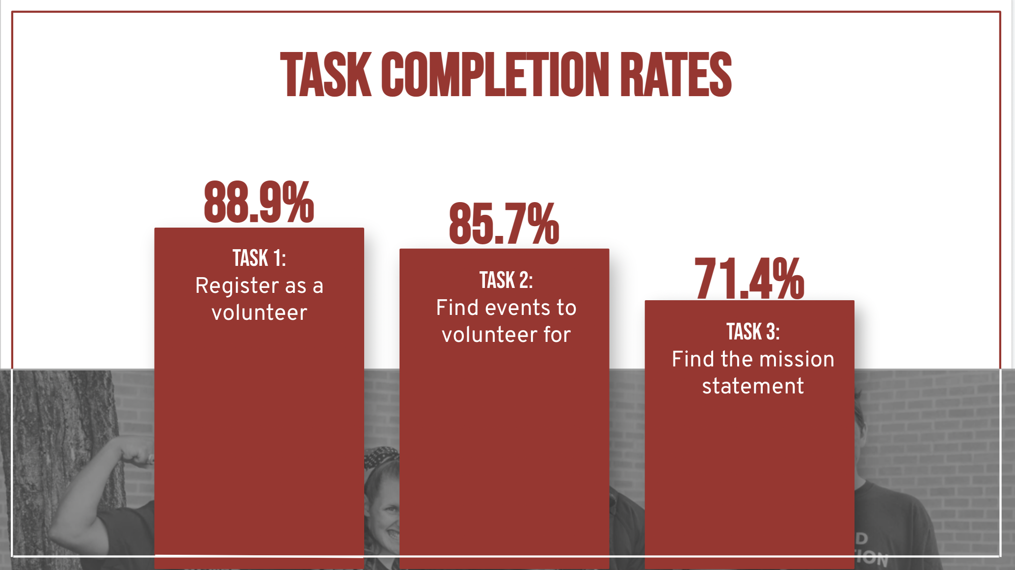
The test results indicated that 80% of users had an issue with navigation.

Ideation & Iteration


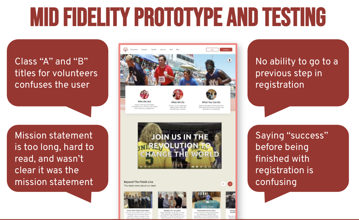
On the current website, you have to pick a volunteer class to register for. You either choose Class A or Class B based on whether you want to become a volunteer coach or a “day-of” volunteer. The user-flow I designed consolidates the two separate registrations so that everyone registers as a “day-of” volunteer then those who wish to become a more involved volunteer such as a coach may select to proceed with the rest of the registration.

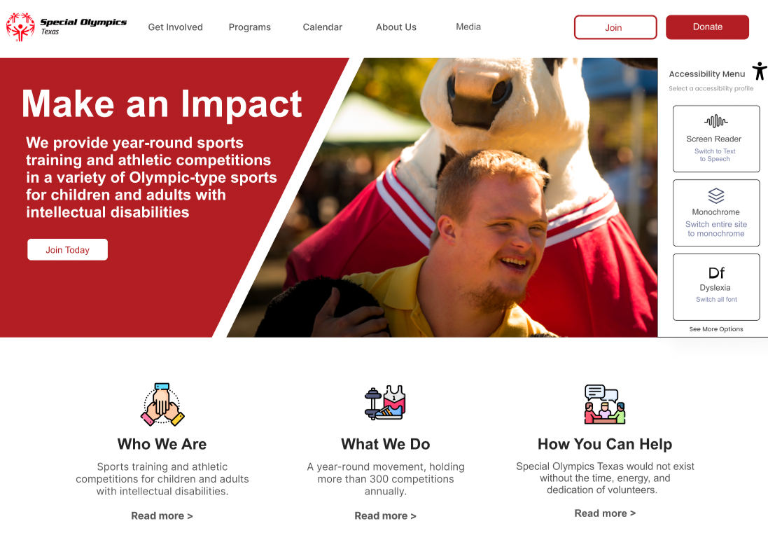
The style guide focuses on using higher contrast colors to increase accessibility across the site. We chose red as a nod to the brand colors for the national organization, but darkened it to suit the diverse needs of our users.
Prototyping


User Testing


Final Designs

While the site colors met AA criteria, the main red background color paired with our main white font color fails AAA criteria. I decided to use the suggested shade of red to increase our contrast ratio to be AAA compliant so no users are affected.

I then double checked all of our images to ensure that overlaid words had sufficient contrast as well. We increased the opacity of the red over the images to remain AAA compliant.

The first iteration of the high-fidelity prototype was designed to produce the filtered events automatically as the boxes are checked, however, one of the design failures on the accessibility report was that every form should have an associated button. I then scrapped the “clear filters” button and added an “Apply” button so that there’s no application of the filters until a submission has been made by the user.

From the homepage, the initial design had two buttons labelled “join” which took the user to the Volunteer Landing Page. Because the testers pointed out that the word “join” doesn’t necessarily mean “volunteer”, I created a “Get Involved” Landing Page that the join button will lead to instead.
The Results
The impact of the redesign was significant:
Navigation issues decreased by 60%, with only 20% of users reporting difficulties compared to 80% previously, reducing frustration and confusion.
Accessibility improvements raised the website’s compliance score from 54 to 96 out of 100, surpassing the recommended threshold and eliminating the risk of legal action while ensuring inclusivity for users with disabilities.
Volunteer and athlete registrations increased by 35%, as the simplified registration process and improved accessibility removed barriers for potential participants.
User satisfaction with the website improved by 70%, as reported through feedback surveys, reflecting a reduction in negative feelings like alienation and frustration.
