

Onbe’s international payout flow, once powerful but overwhelming, was transformed into a simple and transparent user journey. The redesigned experience removes friction, reduces confusion, and significantly boosts completion and confidence.
Overview
Onbe is a global payouts platform supporting funds movement across 180+ countries and 145+ currencies. Each year, millions of recipients—gig workers, maritime crews, research participants, and international teams—rely on Onbe to receive payments quickly and reliably across borders.
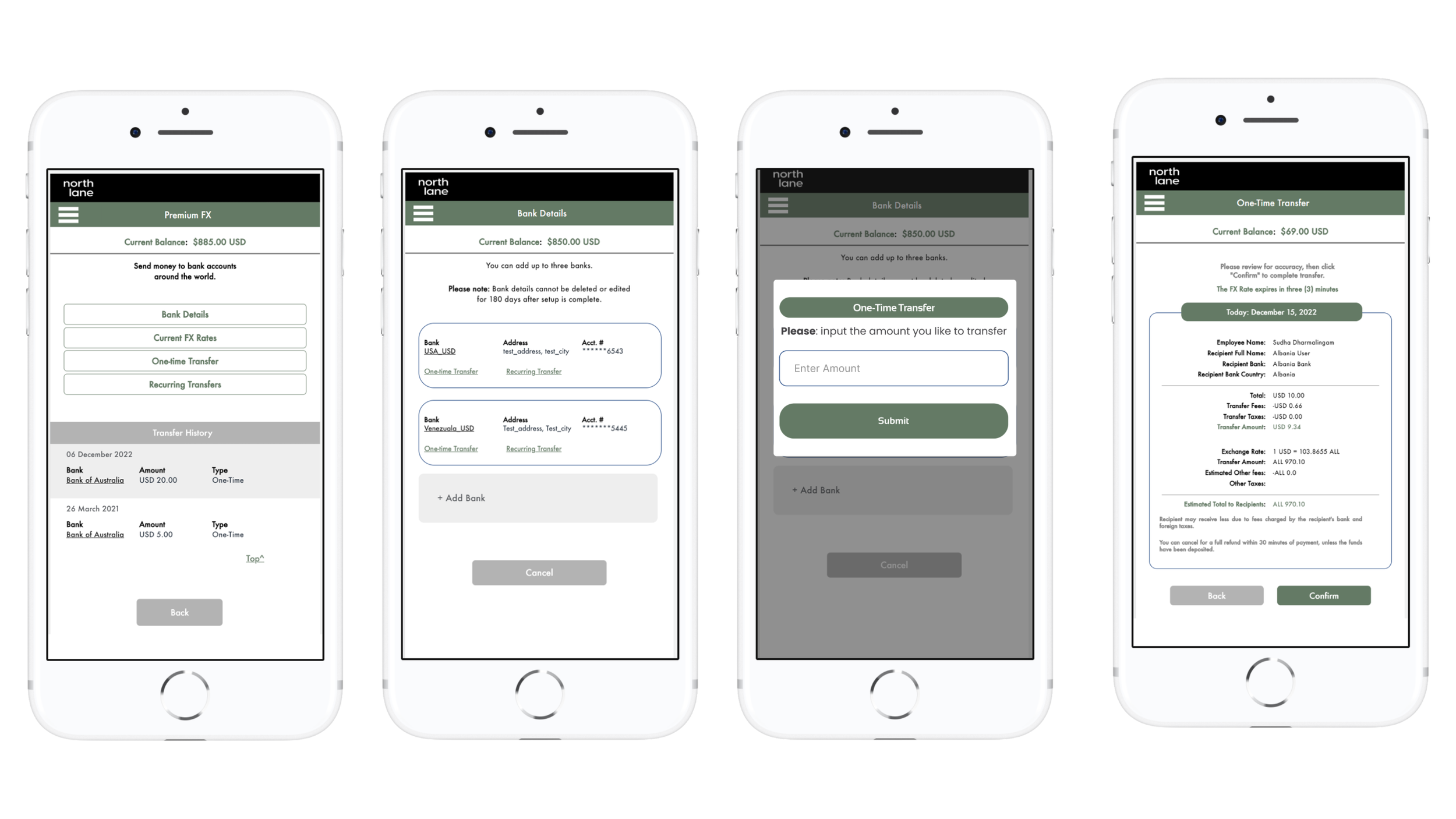
When this project began, the Global Transfer experience was powerful but difficult to navigate. The flow was overloaded with jargon, inconsistent across devices, and lacked the clarity users needed to make confident decisions. The result was a high rate of stalled transfers and abandoned payouts, especially among international recipients accessing the product via mobile.
My Role: As the Product Designer on this initiative, the work focused on:
Identifying usability gaps from analytics, heatmaps, and testing
Simplifying a complex, multi-step flow into a guided, transparent experience
Improving clarity around FX rates, fees, and delivery timelines
Aligning the interface to accessibility, mobile performance, and global user needs
Defining requirements, design direction, and testing plans with engineering
Tools: Figma, Miro, Hotjar, UserTesting
The Challenge: “Users cannot easily understand how to complete a cross-border payout, and the complexity is driving drop-offs.”
Years of incremental updates had created significant design debt: jargon-heavy steps, unclear fee structures, inconsistent patterns, and poor mobile optimization all contributed to user frustration. For international recipients—often operating on limited bandwidth or unfamiliar financial terminology—the flow was particularly confusing, resulting in hesitation, mistrust, and incomplete transfers.
My Approach
1. Research & Analysis
A full audit combined heatmaps, funnel analytics, user interviews, and competitive benchmarking.
Key Findings
65% of users stalled at the “Select Method” step
FX previews were buried, causing late-stage “sticker shock”
70% of tested users struggled to choose country/currency
Same-day payout options were often overlooked
Users lacked early reassurance around security and fraud protection
Competitor analysis (Trello, Paidiem) emphasized the importance of upfront FX transparency and clear delivery expectations.
2. Insights
Four themes emerged:
Clarity first: Users needed instant visibility into fees, FX rate, and delivery time
Mobile-first orientation: 80% of transfers occur in low-bandwidth mobile environments
Show the best option: Guiding users to the fastest or cheapest method reduced drop-off
Trust early: Security signals, not buried disclaimers, build confidence
3. Design Direction
The redesign focused on collapsing complexity and elevating transparency across the experience.
Key Design Moves
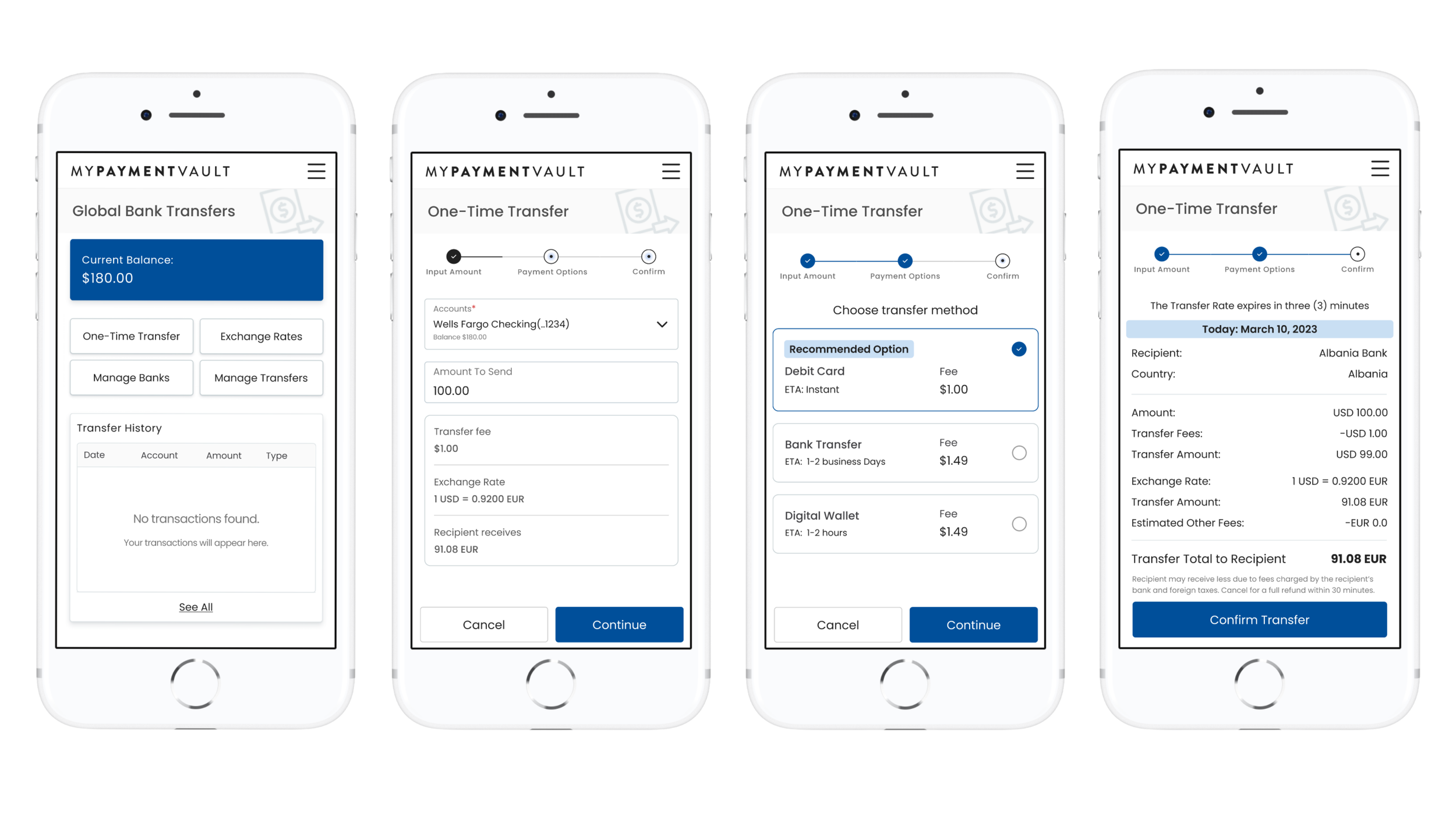
Replaced a 7+ step flow with a 3-step streamlined journey
Added an instant preview panel with fees, FX rate, and estimated arrival
Introduced a choice engine that ranks payout methods by speed and cost
Implemented a global map + search for selecting countries and currencies
Surfaced OnbeGuard security messaging early to reduce hesitation
Improved accessibility with WCAG AA contrast, voice-over support, and offline functionality
Final Designs
A Simplified 3-Step Flow
1. Enter amount → See fees, FX rate, and arrival time instantly
2. Choose method → Smart recommendations (“Quick,” “Reliable,” “Flexible”)
3. Confirm → Biometric authentication + Guard summary
This new structure removes cognitive load and helps users make confident decisions quickly.

The Results
A Simplified 3-Step Flow
1. Enter amount → See fees, FX rate, and arrival time instantly
2. Choose method → Smart recommendations (“Quick,” “Reliable,” “Flexible”)
3. Confirm → Biometric authentication + Guard summary
The Results
Usability
Task completion jumped from 55% → 92% in post-redesign testing
Average flow time: Slashed 40% (from 4:30 min to 2:45 min)
Mobile satisfaction score: 4.8/5, with 85% praising fee transparency
Business Impact
Projected +25% in cross-border adoption (based on A/B pilots)
Zero fraud incidents in test transfers, thanks to upfront Guard integration
Recipient NPS up 30 points — gig workers and crews now “love the previews”
Impact
Fewer abandoned payouts.
More funds flowing where they’re needed most.
Onbe isn’t just processing payments — we’re powering global lives.
This redesign turned complexity into confidence, proving that great UX isn’t a luxury; it’s the currency of trust.