

-
About Facebook
Facebook, now part of Meta, is a global technology company focused on connecting people through social networking, messaging, and various digital platforms. Known for its flagship social media platform, Facebook also invests heavily in innovative technologies like augmented reality, virtual reality, and artificial intelligence to enhance user experiences and support its vast ecosystem of developers and testers. The company’s internal tools, such as debugging software for software testers, are critical for ensuring the quality and reliability of its products.
-
My Role
As a UX/UI Designer at Facebook, I was tasked with redesigning the user interface of an internal debugging software used by software testers. My primary responsibility was to create a more intuitive and visually appealing design system from scratch, ensuring that testers could navigate the tool efficiently and perform their tasks with greater accuracy.
-
Project Overview
The project focused on revamping Facebook’s internal debugging software, which was essential for software testers to identify and label bugs in software builds. The goal was to transform the outdated and developer-designed UI into a user-friendly interface that would reduce errors, improve efficiency, and enhance the overall testing experience for the team.

The Problems
The original debugging software suffered from several usability issues due to its outdated design, which was initially created by a developer without a focus on visual design or user experience. Key problems included:
The UI lacked visual hierarchy and intuitive navigation, making it difficult for software testers to use the tool effectively.
Mis-clicks were frequent due to poorly designed buttons and unclear labeling, leading testers to inaccurately label software builds as either containing or not containing bugs.
The absence of a cohesive design system resulted in a clunky and confusing interface, slowing down the debugging process and increasing frustration among testers.
Testers reported a 30% error rate in bug labeling due to the unintuitive design, which also caused delays in the testing workflow.

The Solution
To address these challenges, I took a user-centered design approach and created a new design system from scratch for the debugging software. The redesign focused on improving visual hierarchy, enhancing navigation, and ensuring intuitive interactions.
Key improvements included:
Developing a cohesive design system with clear typography, color schemes, and button styles to create a visually appealing and easy-to-navigate interface.
Redesigning the button layouts to prevent misclicks, with larger, clearly labeled buttons and sufficient spacing to improve accuracy.
Introducing a streamlined workflow with visual cues to guide testers through the debugging process, reducing confusion and errors.
Conducting user testing with the software testers to iterate on the design, ensuring it met their needs and preferences.
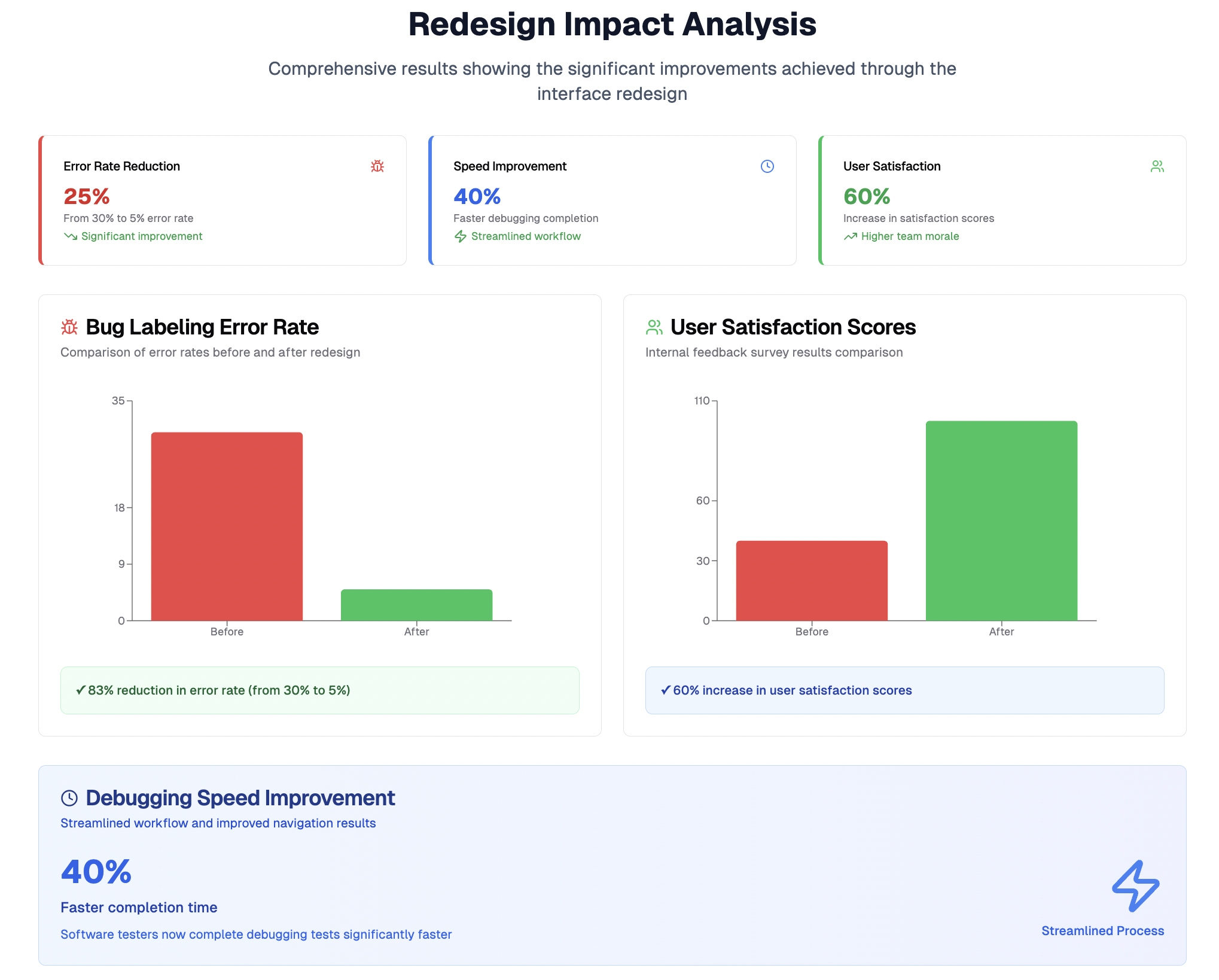
The Results
The results of the redesign were significant:
The intuitive new interface reduced the error rate in bug labeling by 25%, from 30% to 5%.
Software testers completed debugging tests 40% faster due to the streamlined workflow and improved navigation.
Overall user satisfaction with the tool increased by 60%, as reported through internal feedback surveys, reflecting the positive impact of the redesign on the testing team’s efficiency and morale.