

-
About Special Olympics of Texas
Special Olympics of Texas is a nonprofit organization dedicated to providing year-round sports training and athletic competition for children and adults with intellectual disabilities. Through its programs, the organization fosters inclusion, builds confidence, and promotes physical fitness for its athletes while offering opportunities for volunteers to get involved. The Special Olympics of Texas website serves as a critical platform for users to learn about the organization, register as athletes or volunteers, and access event information, making its accessibility and usability essential for fulfilling the organization’s mission.
-
My Role
As a UX/UI Designer for the Special Olympics of Texas, I was responsible for redesigning the organization’s website to address its accessibility and usability issues. My role involved conducting research, performing an accessibility audit, creating user-centered designs, and iterating on prototypes to ensure the website was inclusive, intuitive, and aligned with the needs of its diverse user base.
-
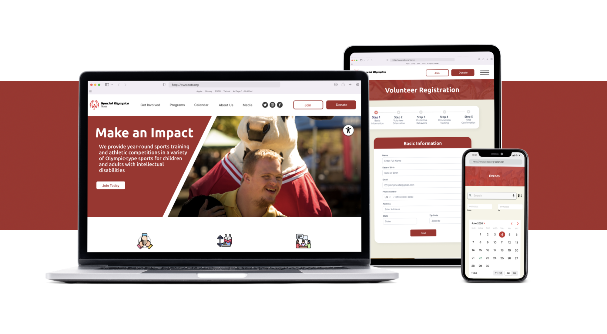
Project Overview
The project focused on revamping the Special Olympics of Texas website, which serves as a vital resource for athletes, volunteers, and supporters to engage with the organization. The goal was to improve accessibility, streamline navigation, and enhance the overall user experience, ensuring that all users—particularly those with intellectual disabilities—could easily register, access event information, and understand the organization’s mission without frustration or alienation.

The Problem
The original Special Olympics of Texas website suffered from significant accessibility and usability issues that negatively impacted the user experience:
An accessibility audit revealed a score of 54 out of 100, well below the recommended threshold of 95, putting the organization at risk of legal action. Key failures included 8 out of 8 font sizes being too small to be readable, 30 out of 162 foreground-background color variations lacking sufficient contrast, and 1 out of 3 forms on the homepage missing a submission button.
Navigation was a major pain point, with 80% of users reporting difficulty finding information due to an inconsistent and redundant layout, leading to feelings of confusion and frustration.
The registration process for volunteers was overly complex, requiring users to choose between Class A (coaches) and Class B (day-of volunteers) upfront, which created confusion and deterred potential volunteers.
Key content like the event calendar and mission statement was not prominently displayed, and the overall page structure was not digestible, making it hard for users to engage with the organization’s offerings.
The Solution
To address these challenges, I conducted thorough research and implemented a user-centered redesign of the Special Olympics of Texas website, focusing on accessibility, clarity, and ease of use. The process and solutions included:
Research and Insights: I began with a competitor analysis to identify strengths and weaknesses, followed by an accessibility audit that highlighted critical design failures. User testing revealed key insights: users wanted a greater emphasis on the event calendar, a clear mission statement, and more digestible pages. These findings guided the redesign process.
Ideation and Design: I created user personas, storyboards, and user flows to streamline interactions. For the volunteer registration process, I consolidated the Class A and Class B options into a single “day-of” volunteer registration flow, with an option for users to proceed as a coach if desired, simplifying the decision-making process.
Style Guide and Accessibility: I developed a style guide using a darker shade of red (inspired by the national Special Olympics brand) paired with white to ensure high contrast and AAA compliance for accessibility. I also adjusted the opacity of red overlays on images to maintain sufficient contrast for overlaid text, ensuring no users were excluded.
Prototyping and Iteration: The initial high-fidelity prototype included automatic event filtering as checkboxes were selected, but user testing and the accessibility report prompted me to add an “Apply” button to meet form submission standards, scrapping the “Clear Filters” button. Additionally, the homepage’s “Join” buttons were relabeled to lead to a new “Get Involved” landing page after testers noted that “Join” didn’t clearly indicate volunteering.
Final Adjustments: The redesigned website prioritized a clear event calendar, a prominent mission statement, and simplified navigation, ensuring all pages were digestible and accessible to users with diverse needs.

The Results
The impact of the redesign was significant:
Navigation issues decreased by 60%, with only 20% of users reporting difficulties compared to 80% previously, reducing frustration and confusion.
Accessibility improvements raised the website’s compliance score from 54 to 96 out of 100, surpassing the recommended threshold and eliminating the risk of legal action while ensuring inclusivity for users with disabilities.
Volunteer and athlete registrations increased by 35%, as the simplified registration process and improved accessibility removed barriers for potential participants.
User satisfaction with the website improved by 70%, as reported through feedback surveys, reflecting a reduction in negative feelings like alienation and frustration.