Global Cross-Border Payout Redesign

Designing clarity for high-stakes international transactions
Impact Summary
TL;DR (Recruiter Scan)
Led end to end redesign of enterprise cross border payout workflows for a global fintech platform serving regulated markets
Increased successful payment completions by 20%
Reduced payout related support tickets by 15 to 25%
Improved adoption of international payout features
Improved WCAG compliance across core payout screens from 60% to 90%
Overview
My role: Senior Product Designer leading research, experience strategy, interaction design, and cross functional alignment across Product, Engineering, Compliance, and Support
Timeline, 2024 to 2025
Focus: Enterprise fintech, Regulated workflows, Accessibility, Operational Efficiency
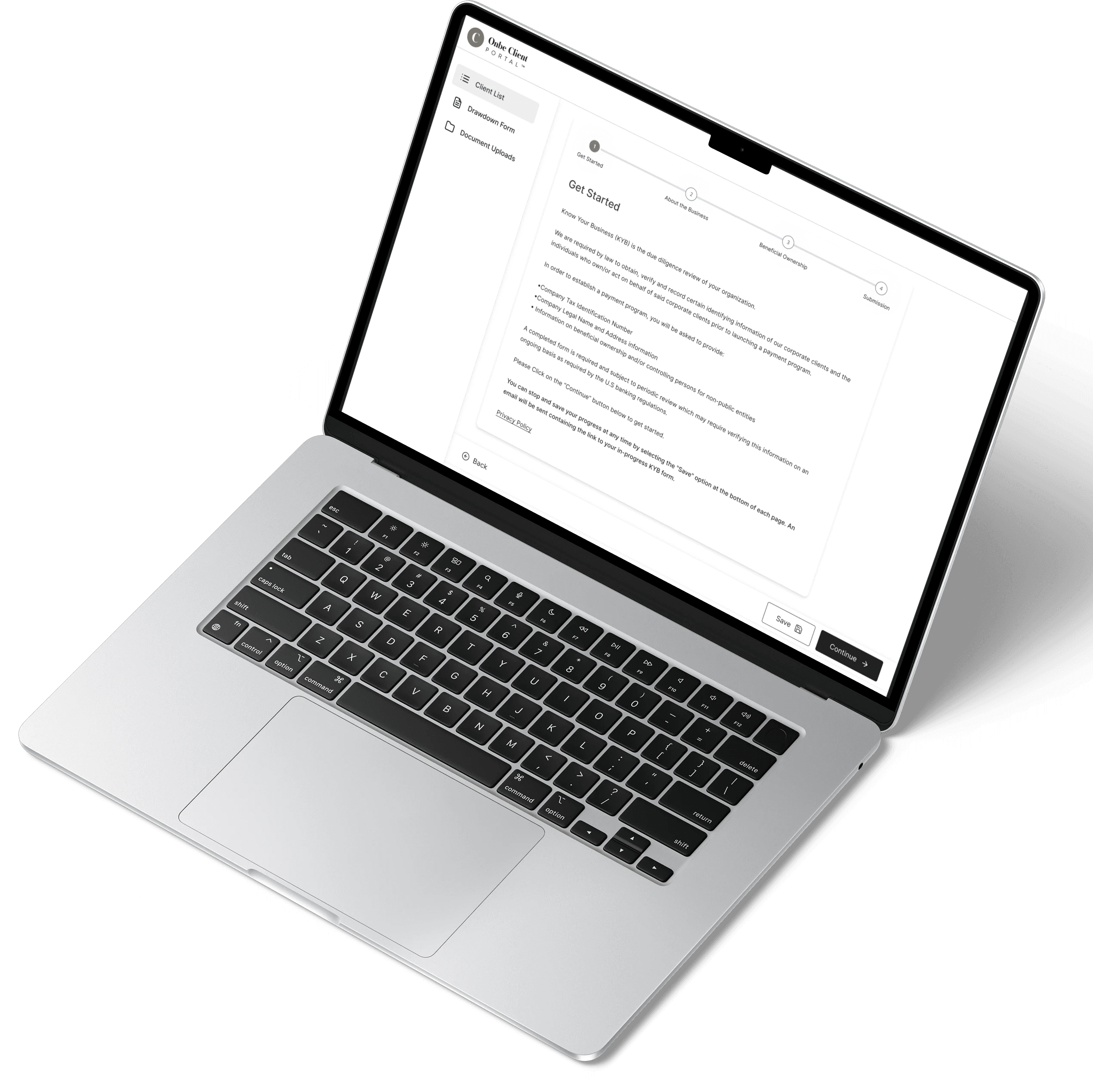
I led the redesign of Onbe’s global cross border payout experience, used by enterprise clients operating in regulated and high risk financial environments. These users were responsible for moving significant amounts of money across regions, where clarity, speed, and trust were critical.
The core tension was balancing compliance safeguards with usability. Regulatory requirements introduced necessary friction, but the experience lacked structure and transparency. My responsibility was to reduce cognitive load and increase confidence without compromising control or compliance integrity.
Problem
The existing experience created hesitation at critical moments in the workflow.
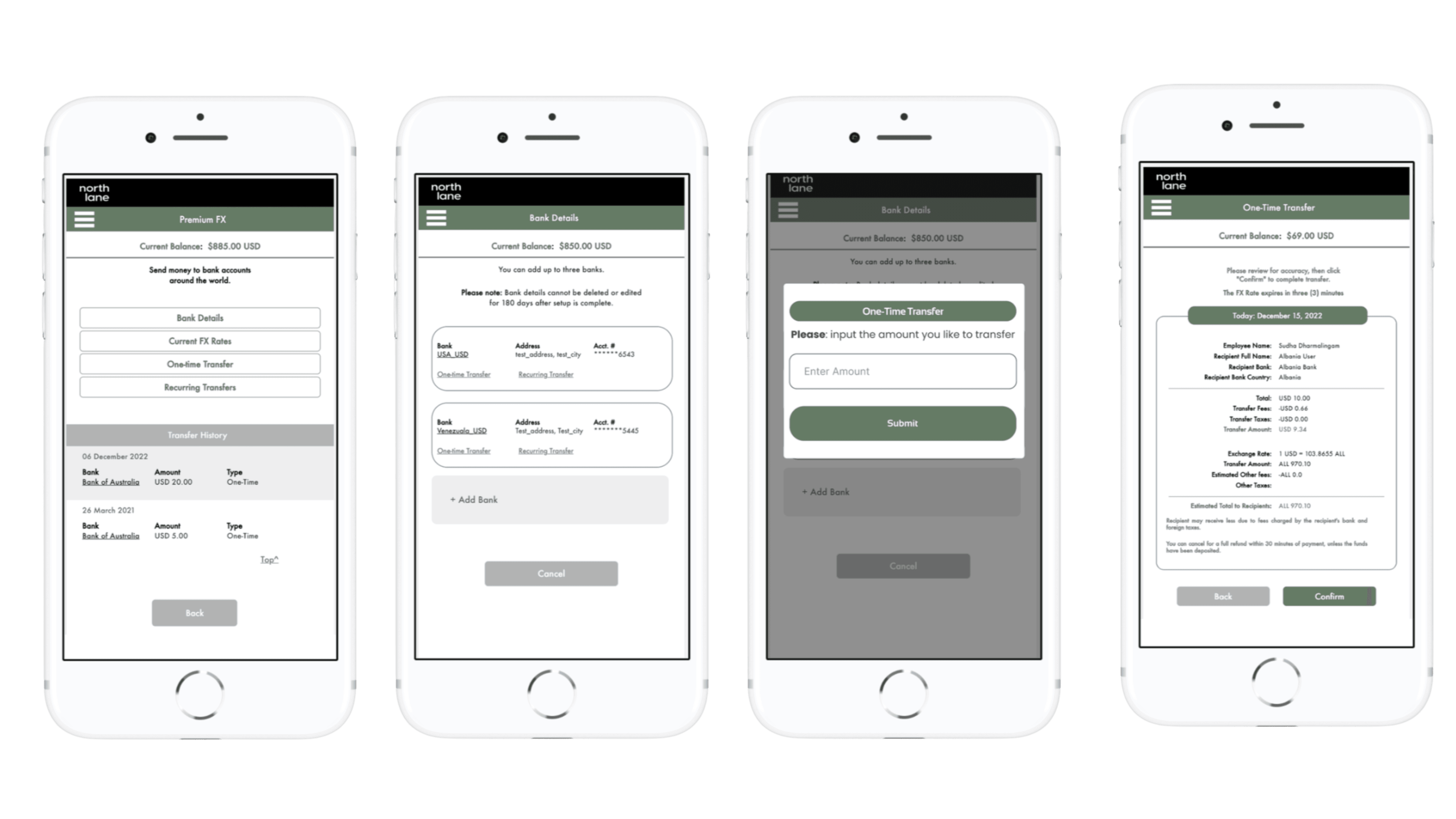
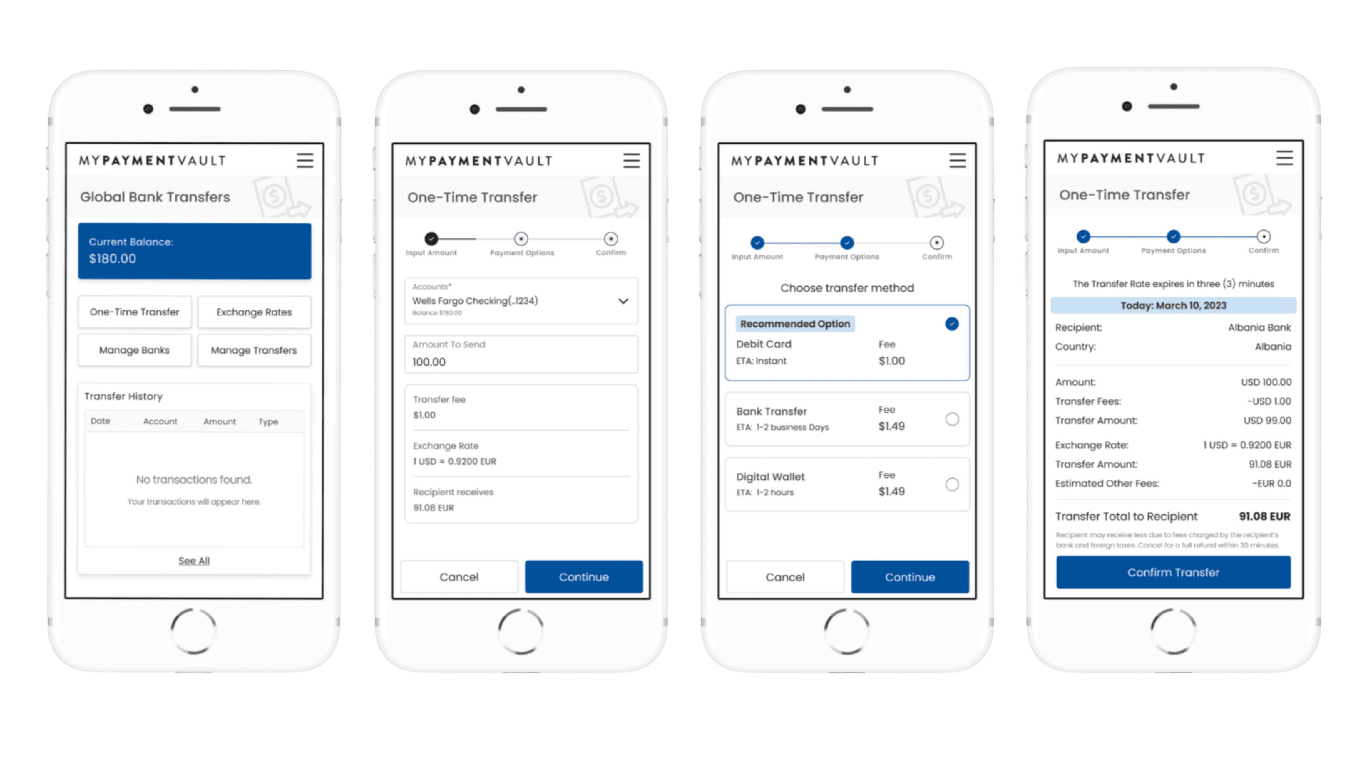
Exchange rates were buried deep in the review step. Users often navigated backward to recheck rates before submitting payments. Analytics showed that 42% of users who reached the review screen left the flow to verify information elsewhere.
Key actions such as sending money, viewing rates, managing banks, and reviewing transfers were distributed across multiple entry points. Heatmaps showed users navigating across four to six sections before initiating a single payout. The system technically worked, but the path to action was fragmented.
After confirming a transaction, users were redirected to the homepage without clear confirmation or next steps. This created uncertainty about whether payments were successful. Support tickets frequently asked whether a payout had gone through.
Session recordings revealed users repeating manual review cycles two to three times per transaction, re entering flows simply to compare rates. In high stakes financial contexts, that repetition erodes trust.
The issue was not functionality. It was confidence. The system did not communicate clearly enough for users to feel in control.
Research & Insights (Approach)
To identify root causes rather than surface level usability issues, I synthesized multiple sources of insight.
I analyzed behavioral data and heatmaps, reviewed more than 400 support tickets categorized as workflow confusion, and conducted moderated usability testing with 65 global enterprise users. I also audited the product against WCAG standards and partnered closely with compliance and engineering to understand regulatory constraints.
A clear pattern emerged. Users did not need fewer controls. They needed clearer structure, earlier visibility into critical information, and stronger feedback loops after high risk actions.
This reframed the problem from simplifying the flow to restructuring the experience around decision confidence.
A key insight emerged:
Users needed clearer structure and feedback to confidently complete high-stakes financial actions.
Solution
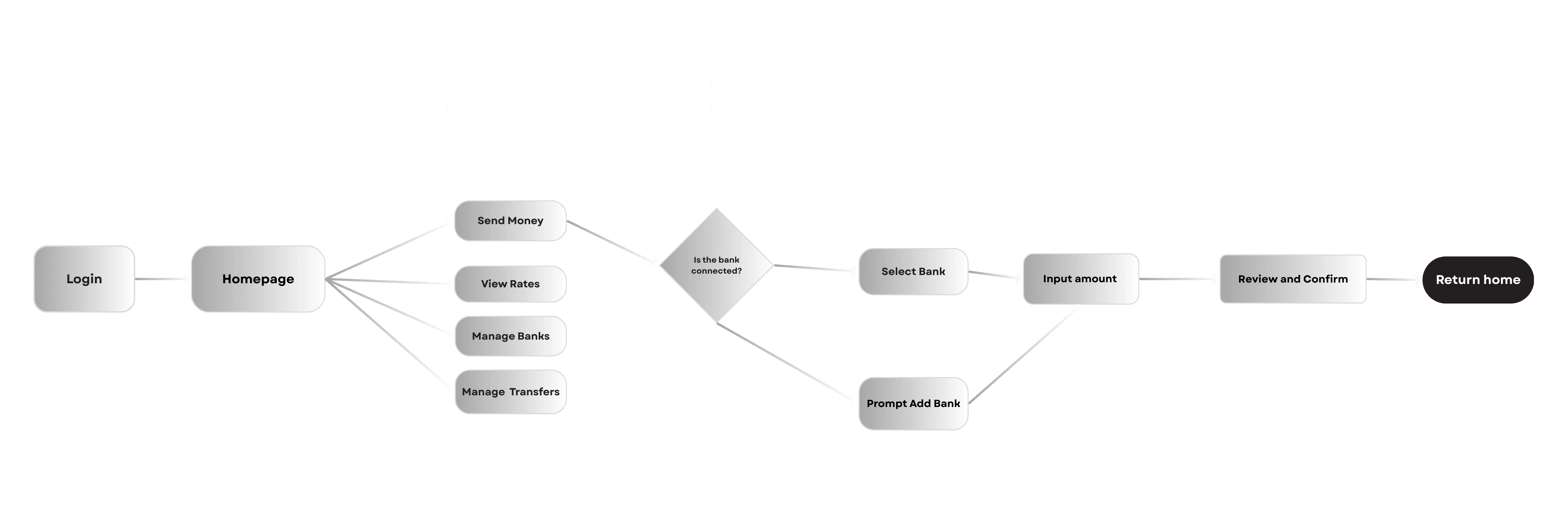
I redesigned the payout workflow around three principles, visibility, structure, and reassurance.
First, I surfaced exchange rates, fees, and delivery timelines earlier in the process, allowing users to make informed decisions before committing to inputs. This reduced backtracking and repeated comparison loops.
Second, I consolidated fragmented entry points into a clearer hierarchy that guided users through a predictable sequence. Instead of navigating across sections, users could move linearly through a structured flow that still preserved control.
Third, I redesigned confirmation and status feedback to explicitly communicate transaction success, next steps, and where to track progress. The goal was to remove ambiguity at the moment of commitment.
Throughout the redesign, I maintained alignment with compliance requirements and partnered with engineering to ensure accessibility improvements were implemented correctly. Accessibility was treated as a product quality lever, not a checklist.
Validation & Results (Impact)
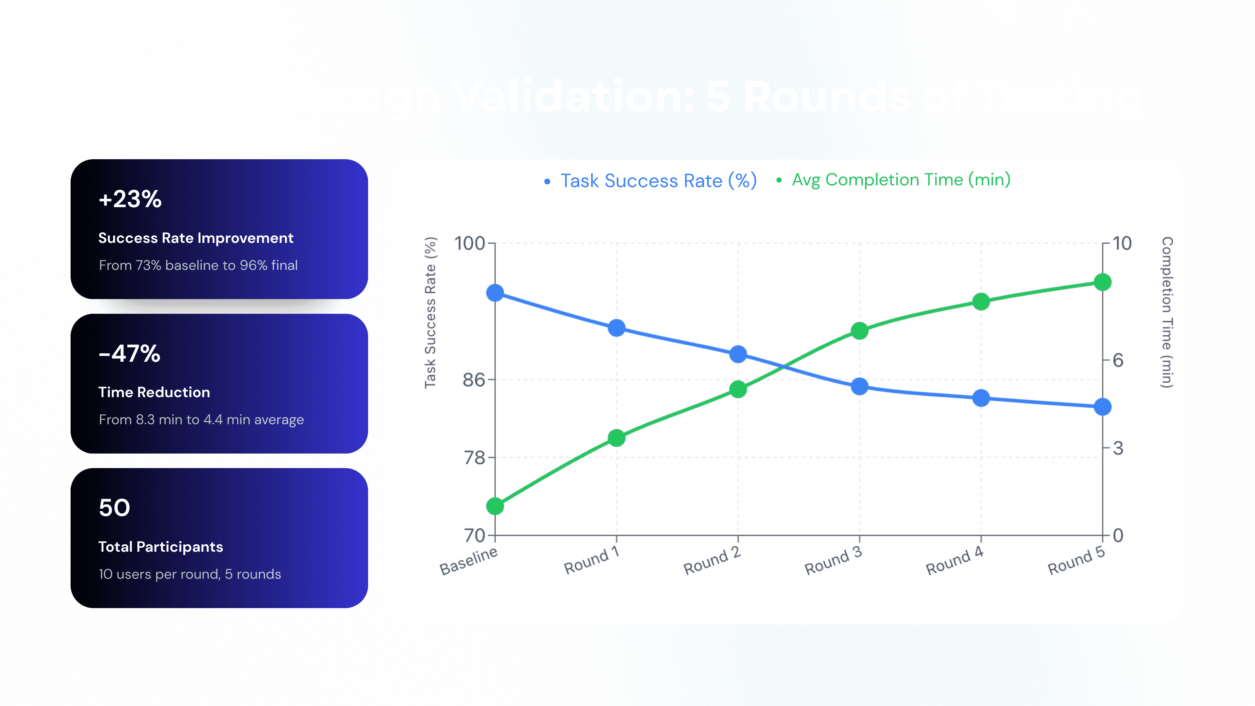
The redesigned experience produced measurable improvements across efficiency, accuracy, and operational impact.
Task completion time decreased by approximately 50% in usability testing, reducing the average payout flow from around three minutes to roughly one and a half minutes by eliminating redundant navigation and clarifying required inputs.
Submission error rates dropped by roughly 30% due to clearer validation patterns and progressive disclosure of complex information.
Adoption of the updated cross border payout workflow increased by 20% in the first months following release, indicating improved discoverability and reduced friction.
Payout related support inquiries decreased by 15 - 25%, reducing operational overhead and freeing support teams to focus on higher value issues.
Accessibility compliance across key payout screens improved from 60% to 90%, significantly improving keyboard navigation, contrast, and screen reader clarity for enterprise users operating in global markets.
How Success Was Measured
Success was measured through moderated usability testing, post task surveys, accessibility audits, product analytics, and qualitative feedback from customer support and enterprise clients. Metrics were tied to task efficiency, error reduction, adoption, and operational impact rather than surface level engagement.
Reflection
This project reinforced that in regulated financial systems, complexity cannot be removed, but it can be structured. Users do not necessarily want fewer controls, they want clarity about what is happening and why.
As a designer operating in enterprise fintech, I learned that confidence is a measurable outcome. When structure, transparency, and accessibility are designed intentionally, usability improvements translate directly into business performance and trust.
That shift from designing screens to designing confidence is what defines senior ownership in high stakes products.
year
2025
timeframe
4 months
tools
Figma
category
B2B