About Onbe
Onbe is a financial technology company that helps businesses handle payments to their customers and employees. They offer easy, ready-to-use solutions that let companies send money to people without having to manage the complicated details themselves. This saves businesses from the hassle, expense, and risks of dealing with payment systems on their own.Project Overview
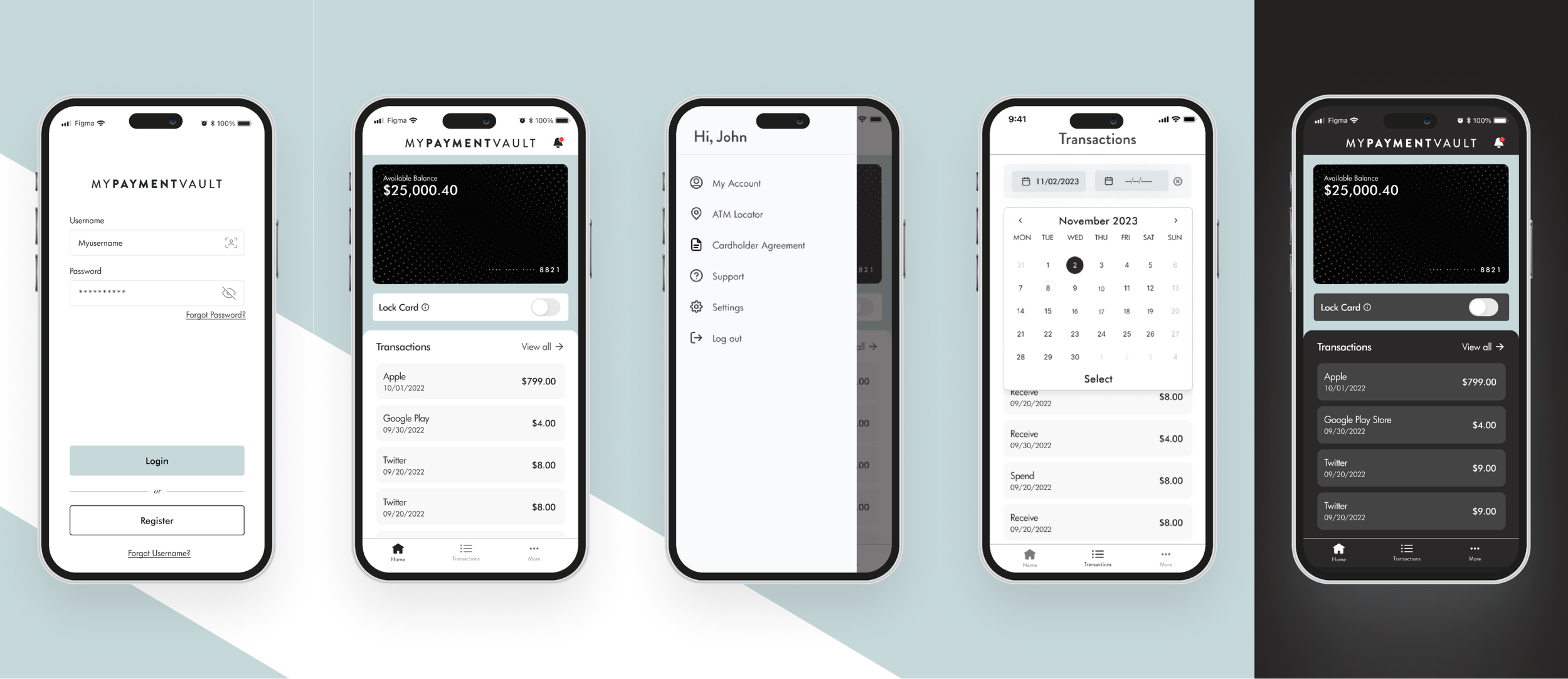
Onbe’s native payments application was outdated and lacked an intuitive user flow. Given that the app is responsible for 65% of total payment transfers, improving the user experience was imperative.My Role
With my role as Lead UX/UI Designer, I worked as a main contributor to the project by helping to define phase one objectives with Product, conduct user testing and research and to lead the team throughout the process.The Problems

This is the original experience of the application.
Issues:
Onbe’s native app was outdated and had not updated visuals or branding in many years created disparity between platforms.
The “Forgot Password” and “Forgot Username” tap targets frequently caused the users to accidentally engage these items while logging in. In addition to causing user frustration this experience was not very accessible.
Users were unaware that the transactions were tappable and would fail to engage the transaction details page. This often led to users calling in to customer service inquiring about further details.
The lack of any Help capabilities within the app led to a transfer abandon rate of X%.
The Solution

To prevent accidental engagement, the “Forgot Username” and “Forgot Password” options were repositioned below the “Register” button, enhancing control hierarchy and reducing accidental clicks by 20%.
For the Dashboard page the users were struggling to identify that the transactions were tappable, in order to bring more visual awareness and let the user know that they are tappable we added light gray boxes around each individual transaction. Doing this helped create a better visual hierarchy and signaled the users that the transactions were tappable. This caused our Transaction Details page engagement to increase greatly.